Karmaka Graphic Design Update
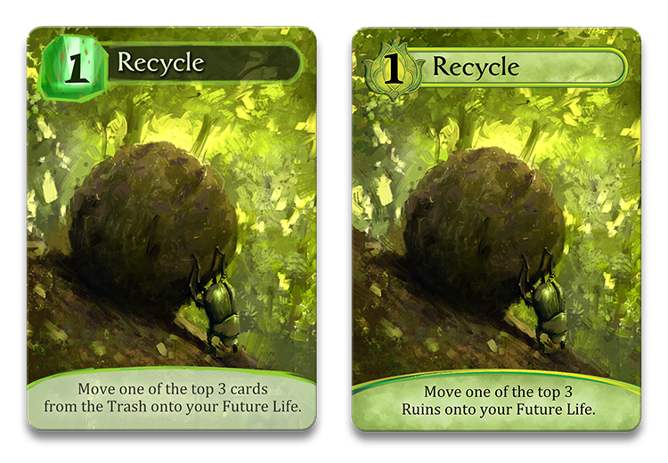
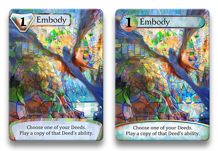
One of the things we’ve focused on over the last month has been the graphic design of the cards for Karmaka. It’s primarily a card game, and we really want the cards to look their best! So we worked on them with a graphic designer, Scott Nicely, and have something we’re really happy with at this point! Here are some before-and-after comparisons:
As you can see the lines are a lot cleaner now, and we feel that green “lotus” color-symbol is a big improvement over that abstract, green gem/mineral. For a while we were trying to design graphical elements that were as impressionistic as Marco’s beautiful art, but in the end we felt this refined look was really sharp while still setting off the underlying art style nicely.
Another change we made in this latest version of the cards was to rename the “Trash” to the “Ruins“, which felt more thematic while still remaining quite intuitive. The corresponding verb, to “trash” a card now becomes to “ruin” a card. What do you think?
Another graphical change we made was to use black text on a light background for all elements – titles as well as ability text. We weren’t sure this was an improvement for every card, but it looks great on most of them, and it’s nice to be consistent. It’s also much easier to read in low-lighting conditions when it comes down to ink on card-stock.
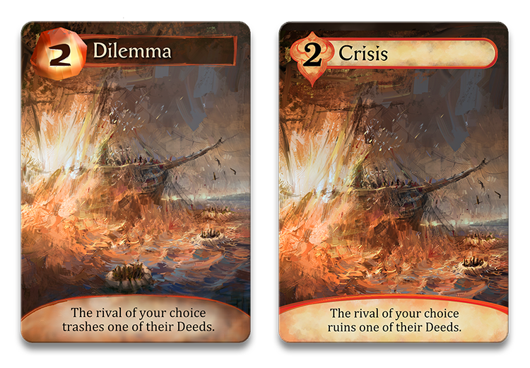
In addition to some art & framing tweaks (all the cards got this to a greater or lesser extent), we renamed ‘Dilemma’ to ‘Crisis’. We liked Dilemma as a title for this card ability (making a potentially difficult decision), but the art didn’t really convey the sentiment so well. But since we love this piece of art so much we decided to rename the card to ‘Crisis’, which ties the art and ability together quite well.
Besides looking much nicer, another great thing about the three new color-symbols is their strong support for color-blind players. The old “gems” had different shapes, but were much less distinct than these new symbols.
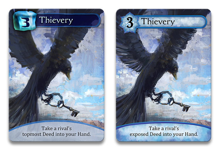
We’ve also reworded the phrase ‘topmost Deed’ to ‘exposed Deed’. In our playtesting some people were interpreting ‘topmost’ as meaning a player’s ‘best’ Deed rather than the one sitting on top. Using the term ‘exposed’ – which we explain in the rules – is less ambiguous, and accentuates the point that the Deed sitting on top is vulnerable.
Finally, the new look for Mosaic cards. While the “diamond” was probably our favourite of the old gems, we think this new look drives home the multi-colored nature of these cards better. We also prefer the new borders and backgrounds behind the text.
What do you think of these changes? Possibly a bit detail-oriented on our part. (Bordering on the obsessive?) But hey, that’s our job! :) If you’re like us, you really appreciate fine artwork in your hands when playing a game – hopefully we’re achieving that!

3 Comments
Seb
August 29, 2015Guys,
Great work! To me, all those adjustments look like true improvements. You are really toiling with detail, but you’re doing it right, and I’m sure that will pay off in the long run.
It all looks fantastic, really. I did like the gems though, especially the diamond. But in truth the only gem that really worked thematically was the diamond. The others only functioned symbolically (i.e. this card is *truly* a gem).
Take care, and keep up the good work!
Jennifer Osterman
February 16, 2016I think the changes you’ve made are superb – crisp, clean and professional-looking. While the previous artwork made sense, the new somehow balances and complements the impressionism of Marco’s artwork better. Sometimes little details make all the difference. Keep up the good work!
Matthieu
February 16, 2016I agree with Seb,
All design and art changes are an improvement! Everything seems to be more crisp and more HD. It’s also easier to read.
Although the “ruin” thing I’m not convinced that someone who hasn’t played or seen the card would know instinctively what it means to “ruin” a card. I agree it works better with the theme and after your first game it won’t matter what verb is used. This is although only one persons opinion.
I wish you guys a easy final push!
Keep it up