Karmaka’s Art Lived Multiple Lives: Part 1, The Cards
I’m Marco Bucci – I painted the cards, box art, and banners for Karmaka. I’ve been part of the team for two years. As I write this, the game is just weeks away from its kickstarter release. We have high hopes for this thing.

But instead of looking into the future, I’m finding myself going back through Karmaka’s many lives, reliving all the art’s (re)incarnations.
I thought maybe you’d like a taste of that.
Looking at finished artwork is like seeing the creative process in reverse. The final answer comes first, then you extrapolate from there, working backward to uncover the steps you think the artist might have taken. The illusion is that the final piece was inevitable, that it existed from the start. That the artist walked a straight line to get there.
That’s never how it goes.
The artist lives the creative process forwards, and at the beginning there is nothing. Literally no things. Art isn’t magic, but it does do what sounds like magic: it converts nothing into something. It’s a process which is all at once painful, beautiful, tortuous, frustrating, satisfying, and above all, endlessly fulfilling. Doing the art for Karmaka was no different.
So let’s go back…and live the story of Karmaka forwards.
* * *
Dave Burke, one half of Hemisphere Games, called me up one day and said, “Hey dude, wanna work on a game?”
Dave’s bouncy tone is always disarming. “Sure,” I said.
“Let’s meet at Holy Oak for a coffee, man. I wanna show you a concept that Eddy and I are bangin’ out. How’s tomorrow, 10:30 A.M.?”
I showed up at 10:31, and there was Dave sitting there with a coffee, a cookie, an iPad, and a bunch of paper cards spread out on the table.
You might be thinking, That’s Karmaka! Nope. Not then. Not even close. This game had no name, no pictures. The writing on the cards was wildly different. After a big huggy greeting we sat down. Dave handed me a bunch of cards. I browsed through them, getting my first taste of some of Karmaka’s iconic titles… Swindle, Recycle, Dilemma, Hell’s Heart…
“We’re in early stages,” Dave explained, “but I think we’re onto something really cool. It’s based on the concept of Karma.” We played the game, and while the mechanics weren’t totally clicking yet (rules were much different two years ago), I could see the contours of a playable game.
“What did you have in mind for the art?” I asked.
Dave tapped open a gallery of images on his iPad. There were cave paintings, Egyptian friezes, weird abstract collages. Not exactly in my wheelhouse. “These images aren’t right for the game,” Dave said. “But we like their timeless vibe. We’re wondering what you can do with these ideas, but in your natural, Marco-Bucci art style.” Another thing I remember from that meeting was Dave’s vehemence about Karmaka not re-treading tired gaming cliches – dragons, ogres, trolls, fairytale creatures. Instead, they wanted to keep it more reality-based and not place it in any one time or era.
I took four cards home to have a crack at illustrating. My only direction at the time: improvise and paint what the words on the cards meant to me. But Hell’s Heart? Stolen Dreams? How do you paint that?
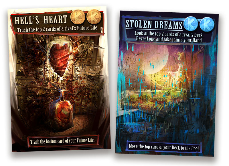
The term Hell’s Heart seemed incongruous. I thought that Hell shouldn’t have a heart. But supposing it did, it would be a very small one – clenched and under constant stress. Constricted. The phrase Stolen Dreams evoked mental images of the starvation and dessication of would-be empires. So I painted that. Above is a copy of the JPG I sent off to Dave and Eddy three days after our first meeting.
They came back enthusiastic. They liked the originality and energy of the work. But they both thought both cards erred on being too busy, abstract, and, Dave’s choice of word: “slashery”. Stolen Dreams skirted a little too close to the realm of science fiction, too. What was an unexpected hit, though, was the hand-painted interface. They’d never seen that before and thought it was a nice departure from the typical, hard-edged look of existing card games on the market. We also agreed that, style-wise, the hand-painted interface was a natural fit for the imagery.
I moved on to other cards, letting my brain wander and the brush fly. I should note here that I didn’t do all the brainstorming myself; Eddy specifically typed out a bunch of thoughts for different cards. He’d send me links to pictures of birds, insects, or animals he liked with thoughts attached (eg. For Thievery, “A dynamic image could be a vulture stealing a piece of carrion.” For Recycle, “How about a dung beetle pushing his ball of poop?”)
Here are some V1’s of various cards.

Often you mine valuable treasures during the first pass. Looking back at these, I see the bold composition of Dilemma, the calmness of Another Day, the pernicious feel of Spite. Recycle practically hit the bullseye on its first pass – just one of three cards to boast that achievement, Dwindle and Sowing being the other two:

Eddy and Dave provided honest feedback. Here’s Eddy on my V1 of Salvage:
“I like the concept, but I’m not so sure it comes across in this piece. The aesthetics & light are great, and I’m a fan of keeping things somewhat abstract/impressionistic, but I feel like the overall shape and meaning isn’t so clear.”
That’s good feedback. It let me know that the subject matter is fine – i.e. I didn’t have to change the shipwreck idea – I just had to paint it in a way that was more visually clear.
The next version sold.

Revisions ranged wildly. Sometimes Dave and Eddy loved most of the card, but wanted to change one thing. Like on Vengeance:

The only thing that changed was the figure, morphing from Japanese Samurai to primitive caveman. Artistically, I also like how the dark shapes of the cave melt into the dark shapes of his form. A painter lives for that stuff.
Here are some more V1-V2 comparisons:


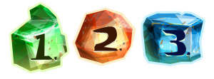
We were also playing with different interface shapes for each colour. Red’s interface was angular, Blue’s circular, and Green’s parabolic – each of these shapes subliminally identified the overall “attitude” of the colour sets.
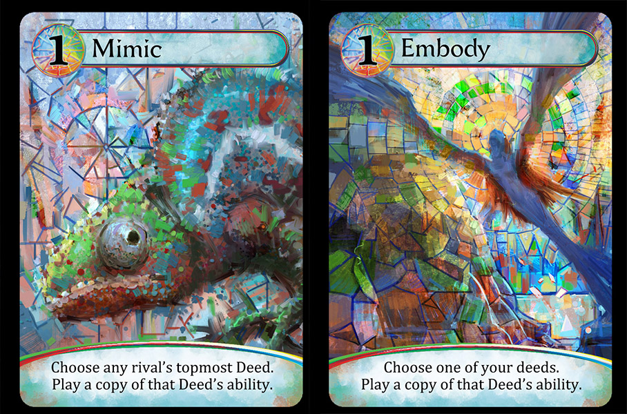
There is a fourth type of card in Karmaka – the two “Mosaic” cards. These are chameleons essentially, and count toward whichever colour the player chooses.

A literal chameleon was the obvious choice for Mimic, since not only does the card allow you to mimic the colour of another card, you can also mimic its ability, too.
An interesting thing happened here. During a Skype call, Dave, Eddy, and I puzzled over how to make these Mosaic cards identifiable. We knew we wanted them to represent all three of Karmaka’s colours, but didn’t want to simply paint an image with a broader palette (we thought if we did that, it might make the other cards look too limited by comparison). So the solution was to import the look of actual mosiac artwork. As I painted, I steered away from simply copying the mosaic look, and married it with a luminescent, stained glass aesthetic. We all agreed that this really helped the cards identify as their own subset in the game. There were actually minimal changes to these from my V1’s: just a few drawing tweaks here and there, and a bit more variety of colour imparted to Embody. Here are their in-game finals:
I haven’t mentioned the point-identifiers yet. We started with a “Karmic Coin” which would be colour-corrected to match the card in question (you can see these in use on the original Hell’s Heart and Stolen Dreams.)
We abandoned the coin idea pretty quickly because something about it felt cliched. It was also not an economical design choice: a three-point card needed to have three coins on it, taking up valuable real estate. So we switched to gems. Everybody thought this idea felt more consonant with the game’s feel and theme.
We were months into the project at this point, half a year maybe. All the while, Dave and Eddy had been printing off the latest versions of the game, play-testing it with groups of trusted people. As external feedback came in, rules changed, gameplay changed, cards were born while other cards died or got renamed. One such castoff was this one below. It started off as a Green Card, Longevity. Then it migrated over to a Blue card and was renamed to Off The Record. Then it got cut from the game completely.
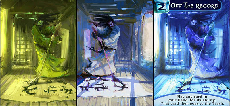
(In hindsight, I’m glad this one is gone. It’s uncomfortably close to an image from the movie, Hero.)
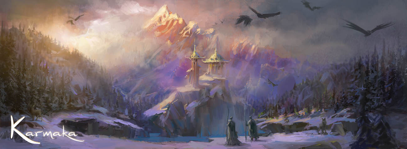
At this stage in the project we felt it was time to tackle the box art based on the themes and style we had created thus far. This took some time, and I’ll write about it in a follow-up post.
Meanwhile, back in the land of card-art, Dave and Eddy had bitten the bullet and hired a graphic designer to see what he could do with the interfaces. They still liked my hand-painted one, but doing their diligence, wanted to see if it was at all possible to find something better. It turns out, they did. Designer Scott Nicely came up with what is the final interface for the cards. It was sad to see the hand-painted gems and boxes go; we all still like them. But I do think that we made the right call to have the interface pop out from the card, rather than blend in. Maybe I’ll pull out the hand-painted interface idea for a future project.
The actual art on the cards was now well into their third and fourth lives. Most of the changes at this stage were minimal. Jubilee, for instance, just needed a focal point.

Peek needed a small alteration to make it a bit sneakier.

Some cards did require total re-paints. Dave and Eddy really liked the art on Panic, but felt it didn’t quite fit the card’s in-game meaning. We kept the idea of fire, though, and turned it into this:

The game had some late card entries, too. Denial among them. By this point I knew the look and feel of the game so well that I was able to nail it right off the bat:

There’s more Karmaka art in my archives, and many pieces have stories to tell. But let’s close the book on the cards for now. Up next, the image that glues everything together: the box art.